Radio button
No accessibility annotations are needed for radio buttons, but keep these considerations in mind if you are modifying Carbon or creating a custom component.
What Carbon provides
Carbon bakes keyboard operation into its components, improving the experience of blind users and others who operate via the keyboard. Carbon incorporates many other accessibility considerations, some of which are described below.
Keyboard interaction
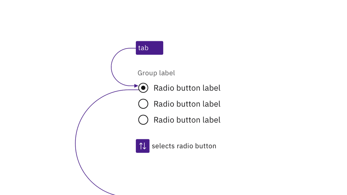
A group of radio buttons takes a single tab stop. Carbon requires an item to be
selected by default, and this item will always take focus. The user changes the
selected radio button using the arrow keys (up/down or left/right). Pressing
Tab again will move focus out of the radio button group to the next component.

A radio button group is a single tab stop and radio buttons are selected using arrow keys.
Labeling and states
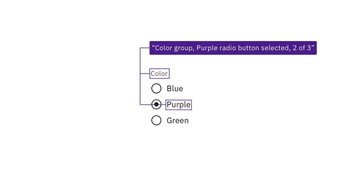
Carbon surfaces the labeling of radio buttons and groups to screen readers and other assistive technologies. Carbon also provides state and context information, such as the number of items in the radio button group.

JAWS screen reader output, based on the information provided by Carbon.
Development considerations
Keep this in mind if you’re modifying Carbon or creating a custom component.
- Carbon uses
fieldsetandlegendto group and label sets of radio buttons. - Carbon uses
labelandforto programmatically connect radio buttons with their labels. - Required radio button groups must be identified programmatically, either via
the label or with
aria-required. - See the ARIA authoring practices for more considerations.